VernacularSerif
Information

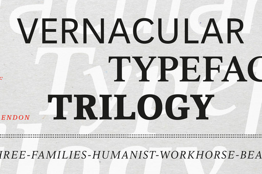
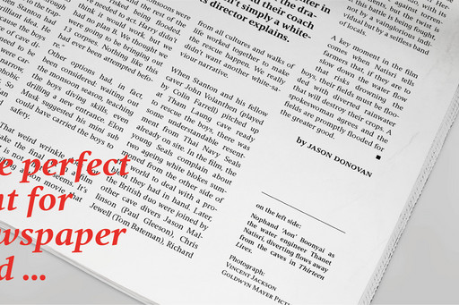
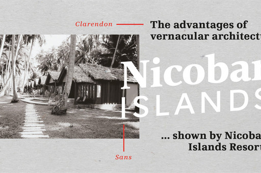
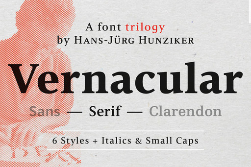
The build up of the inital project had the effect of bringing the different styles closer together. Sans and Clarendon have a vertical axis and similar endings in contrast to the Serif with a traditional diagonal axis.The straight stems from the original project are used as an element to stress the closeness of the type family. They thus share a comon feature.

Detail
ReleaseMarch 2021
Character set Latin
Credits
DesignHans Jörg Hunziker
Tester
Headline settings
Regular
BlackBlack ItalicBoldBold ItalicDemiDemi ItalicMediumMedium ItalicRegularRegular ItalicRomanRoman Italic
pt
Text settings
Regular
BlackBlack ItalicBoldBold ItalicDemiDemi ItalicMediumMedium ItalicRegularRegular ItalicRomanRoman Italic
2 columns
1 columns2 columns3 columns
pt
The Evolution of Scripts

The oldest finds are actually about 10,000 years old. However, the more precise history of the script can only be proved from about 3200 BC, i.e. almost 5000 years into the past. At that time, writing was initially used only for religious and ritual purposes, often for inscriptions, and later with urban development and agricultural development for accounting purposes. In the beginning, there were geometric figurative signs for numbers and names as well as stylized figurative signs for objects (hieroglyphics, Sumerian cuneiform). A blunt handle replaces the pointed handle. The symbols thus appear less pictorial, become more abstract and change from figurative signs to ideograms, i.e. characters that describe an idea, a thought.

Phonographic development of cuneiform script.
A sign of a sound rather than a meaning. So, e.g. can a ball be simply represented as a circle, but Bill as a name? For once, the sound pattern for Ball was used for the similar name Bill.

3. JT vChr
The Akkadies in northern Mesopotamia, i.e. in present-day Iraq, take over the Sumerian cuneiform script and develop it further in the direction of phonetic writing. The Assyrians and Babylonians developed the cuneiform script as we know it today.

The first script that was consistently based on a sound system was the Linear B, about 1400 BC, developed by the Mycenaean Greeks. The Linear B is a pure syllable script in which each pair of vowel consonants is represented by a single figurative sign. The syllables are supplemented by logograms and a number system with base 10. A short vertical stroke serves as word separation. The Linear-B was not deciphered until 1952 by Micheal Ventris.

North-Semitic to Phoenician

The evolution of today's alphabet
The discovery of the alphabetic principle consists in splitting syllables into consonants and vowels. We can assume that all alphabetical writing systems are derived from the Semitic alphabet, which was developed by the Phoenicians (biblical name for Canaan, now Lebanon) around the 2nd century BC.

Phoenician Alefbet
Modern versions of the Semitic script are e.B. Hebrew and Arabic. The most important feature of Semitic writings is the absence of vowels. Sounds were represented by images whose name begins with the desired sound, just like the hieroglyphics or the Akkadian cuneiform script. So, e.g. water starts with w and this sound has been figuratively described. This resulted in a 22-character system that begins with alef, bet and gimel and is capable of describing all the meanings of a Semitic language.

Phoenician – Greek
The transition of the alphabetic system with consonants to full splendour with consonants and vowels happened about 1000 to 900 BC when the Greeks adopted the Semitic script for their language. Scholars have long considered this development to be ingenious, but in fact it was above all the logical and consistent adaptation of an existing alphabet to one's own language.

The consonants were taken over 1:1. 6 Semitic sounds that do not occur in Greek are replaced by vowels, as they occur in the Greek language. 5 more characters for Greek sounds were added.

Phoenician - Greek - Latin
The Etruscans (Italy) adopted the Greek alphabet around 700 BC and also many Greek words and general culture. They formed the Latin script, which was to be the scripture of the scholars until the Middle Ages. Further developments in Latin script result from changes in the phonology of the Latin language and from the Romance languages that developed from it. Again, some changes were made to the characters in order to adapt it to the specifics of the Latin language.

VernacularSerif
VernacularSerif
VernacularSerif
VernacularSerif
VernacularSerif
VernacularSerif
VernacularSerif
VernacularSerif
VernacularSerif
VernacularSerif
VernacularSerif
VernacularSerif
VernacularSerif
VernacularSerif
Global Settings
pt
Weights overview
Black
BlackBlack ItalicBoldBold ItalicDemiDemi ItalicMediumMedium ItalicRegularRegular ItalicRomanRoman Italic
Latin
Latin
pt
Black Italic
BlackBlack ItalicBoldBold ItalicDemiDemi ItalicMediumMedium ItalicRegularRegular ItalicRomanRoman Italic
Latin
Latin
pt
Bold
BlackBlack ItalicBoldBold ItalicDemiDemi ItalicMediumMedium ItalicRegularRegular ItalicRomanRoman Italic
Latin
Latin
pt
Bold Italic
BlackBlack ItalicBoldBold ItalicDemiDemi ItalicMediumMedium ItalicRegularRegular ItalicRomanRoman Italic
Latin
Latin
pt
Demi
BlackBlack ItalicBoldBold ItalicDemiDemi ItalicMediumMedium ItalicRegularRegular ItalicRomanRoman Italic
Latin
Latin
pt
Demi Italic
BlackBlack ItalicBoldBold ItalicDemiDemi ItalicMediumMedium ItalicRegularRegular ItalicRomanRoman Italic
Latin
Latin
pt
Medium
BlackBlack ItalicBoldBold ItalicDemiDemi ItalicMediumMedium ItalicRegularRegular ItalicRomanRoman Italic
Latin
Latin
pt
Medium Italic
BlackBlack ItalicBoldBold ItalicDemiDemi ItalicMediumMedium ItalicRegularRegular ItalicRomanRoman Italic
Latin
Latin
pt
Regular
BlackBlack ItalicBoldBold ItalicDemiDemi ItalicMediumMedium ItalicRegularRegular ItalicRomanRoman Italic
Latin
Latin
pt
Regular Italic
BlackBlack ItalicBoldBold ItalicDemiDemi ItalicMediumMedium ItalicRegularRegular ItalicRomanRoman Italic
Latin
Latin
pt
Roman
BlackBlack ItalicBoldBold ItalicDemiDemi ItalicMediumMedium ItalicRegularRegular ItalicRomanRoman Italic
Latin
Latin
pt
Roman Italic
BlackBlack ItalicBoldBold ItalicDemiDemi ItalicMediumMedium ItalicRegularRegular ItalicRomanRoman Italic
Latin
Latin
pt
Buying Options
5 users
5 users10 users15 users20 users30 users40 users50 users60 users70 users85 users100 users110 users120 users140 users160 users175 users195 users215 users235 users260 users280 users300 users330 users365 users390 users435 users460 users485 users520 users550 users575 users610 users675 users705 users730 users755 users780 users805 users830 users855 users880 users930 users975 users1k users1.1k users1.2k users1.3k users1.4k users1.5k users1.6k users1.7k users1.8k users1.9k users2k users2.2k users2.4k users2.6k users2.8k users3k users3.5k users4k users4.5k users5k users
250k mth. views
250k mth. views500k mth. views1M mth. views5M mth. views10M mth. views
1 Titles
1 Titles4 Titles6 Titles12 Titles24 Titles48 Titles
Individual Scripts
SUM (net)
0.00
News

Font Technology

21.04.2021 

jpFonts starts with so-called variable fonts. Variable fonts are linearly interpolable OpenType fonts. A variable font consists of a font file, with which different weights, font widths and font layers can be interpolated and generated in an…

more

Pulse JP Super Family

01.11.2022 

Pulse JP was designed by Volker Schnebel. This super family comes with a total of 48 fonts, each 12 styles for regular, condensed, extended and compress, all in roman and italic. jp Fonts is really proud to present this exceptionally versatile and…

more

Volut Font Family

11.01.2023 

11.1.2022 Vulot was designed by Christoph Ulherr. The family includes four variants as Base, Blocks, Outline, and Outline Blocks. Volut is really fun, but only in really large point sizes. Just try it yourself with our test drive.

more
Corporate Type
Corporate Type

Type as part of the corporate design is of fundamental strategic importance for a company's communication. It contributes significantly to a distinctive appearance of a company. Good examples of this are e.g. Mercedes, Nivea (Beiersdorf), political parties or numerous TV channels. More and more companies recognize and acknowledge the high value of their own corporate type.

We are experts in the development of corporate fonts. The successful production of a typeface requires in-depth know-how in font design and technical implementation. A corporate font should work in both communication and products. In more than 4 decades, we have successfully implemented countless corporate type projects.

FONT-SERVICE

jpFonts is a service provider for all matters related to fonts. Whether designing a new font, expanding an existing font or optimizing the characters for special applications – we cover all areas and requests.
Custom Fonts

Due to our very long experience, we have a profound knowledge and expertise in the design of custom fonts. We accompany this process from the first briefing to the finished font and offer technical support at all times after implementation.

Language Extension

Cyrillic, Greek, Arabic, Hebrew, etc. - no problem. We can create and technically implement the required characters for almost all languages / scripts for you (OpenType with Language Featues).

Additonal Styles

Extra-Light, Black, Italic or Condensed – we can easily create additional font styles to your font family.

Logotype

If you want to have a complete font created from the characters of your logo, please let us know.

Character Optimization

You just want to change or redesign individual characters of your font? We are more than happy to take over.