
Information


Global Settings
pt
Weights overview
Buying Options
News
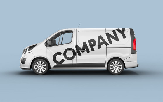
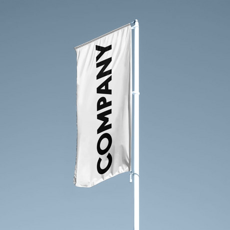
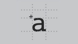
Corporate Type
Corporate Type
Type as part of the corporate design is of fundamental strategic importance for a company's communication. It contributes significantly to a distinctive appearance of a company. Good examples of this are e.g. Mercedes, Nivea (Beiersdorf), political parties or numerous TV channels. More and more companies recognize and acknowledge the high value of their own corporate type.
We are experts in the development of corporate fonts. The successful production of a typeface requires in-depth know-how in font design and technical implementation. A corporate font should work in both communication and products. In more than 4 decades, we have successfully implemented countless corporate type projects.


FONT-SERVICE
jpFonts is a service provider for all matters related to fonts. Whether designing a new font, expanding an existing font or optimizing the characters for special applications – we cover all areas and requests.
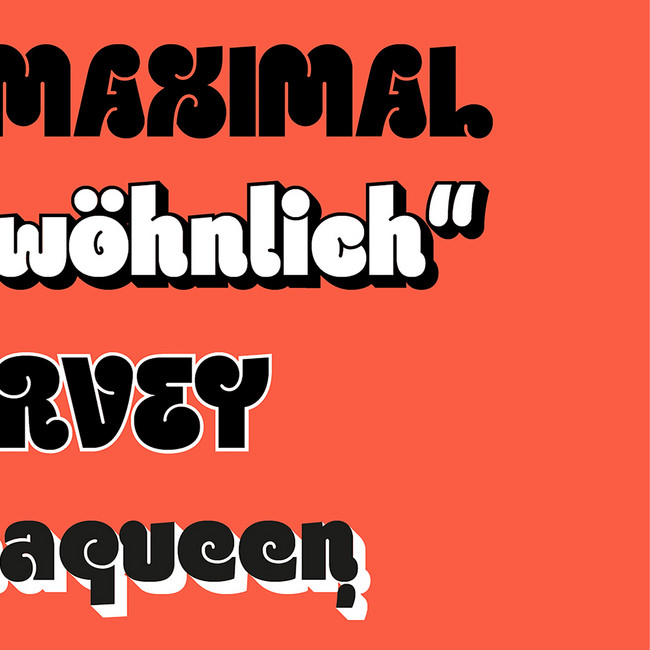
Custom Fonts
Due to our very long experience, we have a profound knowledge and expertise in the design of custom fonts. We accompany this process from the first briefing to the finished font and offer technical support at all times after implementation.

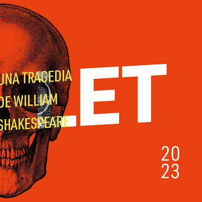
Language Extension
Cyrillic, Greek, Arabic, Hebrew, etc. - no problem. We can create and technically implement the required characters for almost all languages / scripts for you (OpenType with Language Featues).

Additonal Styles
Extra-Light, Black, Italic or Condensed – we can easily create additional font styles to your font family.
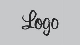
Logotype
If you want to have a complete font created from the characters of your logo, please let us know.

Character Optimization
You just want to change or redesign individual characters of your font? We are more than happy to take over.